Your collection of websites seem to share the same quest: reversing our understanding of the web structure. This focus is particularly straightforward in BACKA teater website, an interface where the structural divs become abstract forms of a small theater. Would you say that this is a direct analogy with your approach to the web: a set of geometric forms that can be rearranged indefinitely? Can you explain where this particular focus for the structure comes from?
My works are focused on exploring different way of approaching or connecting between graphic design and web coding. It can be considered as making an experimental website when you look at them individually, but as a whole, the work I’m doing can be an act of suggesting the possible variations which in the end can wide the perspective of users and use the format ’website’ more effectively. it’s more like an act, rather than making something complete, skillfully well cleaned result. It’s true that my goal is deconstructing ready made template and try more diverse approaches, but actually, the backa teater work was part of campaign, to make website more welcoming, for those theater customers, who are mostly younger like teenagers. So the moving divs and templates are aimed to just destroying the website and adding unexpected interactions to attract younger generations’ eyes.
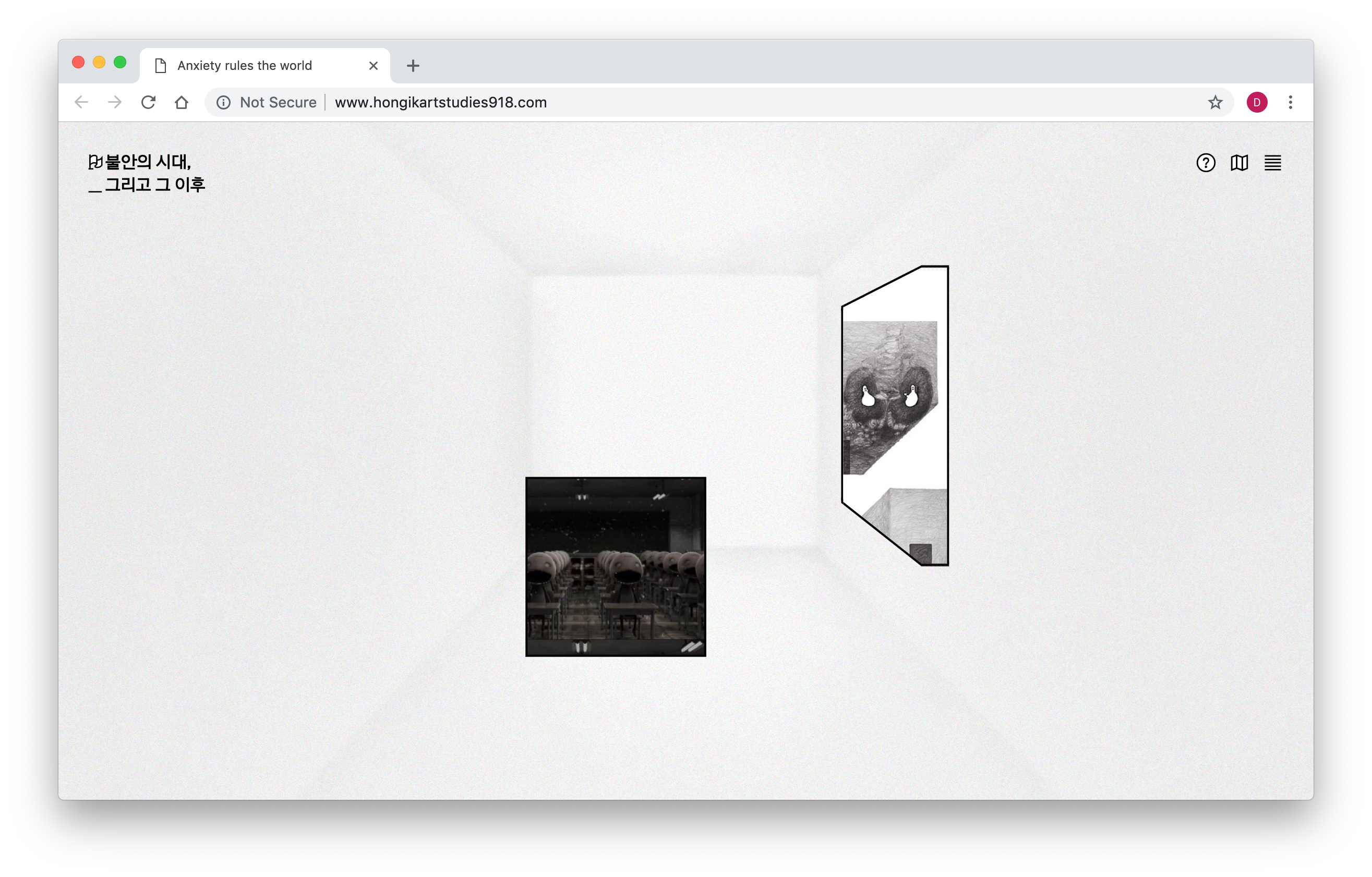
For Anxiety rules over the world Exhibition website, Open Recent Graphic Design or even in ISIA WT Summerschool you used 3D structures to recreate virtual environments. Do you see 3D as a way to escape the “flat rectangle shape” layout? Does this allow you to have more freedom in the organization of online content?
There’s two reasons: First, yes as you said, since most of websites are still restricted into 2d graphics and flat shapes, using 3d shapes contains the intention to break it and try ‘new/not used way. And second, I believe 3d shapes works really well with interaction, since people can interact with 3d shapes, rotate, twist, and move. this means interaction enables to change the visible side, which is impossible when they are printed as static outputs. I believe 3d shapes is one way to effectively use interaction, and can work as a proper answer to the question ’why does it has to be posted on ’web’ with ‘interaction’?’
While today most web interfaces emphasize user-friendliness and ease-of-use, do you sometimes face user's reviews or feedback complaining about arduous navigation? Does this sometimes impact the end-result of your websites?
I always get the feedback regarding the bad user experiences. It’s is true the website I made are confusing, not familiar and sometimes even buggy or slow Its because partially I believe those called ‘good user experience’ or ‘user friendly’ are mostly comes from familiarity, which means it’s user friendly not because it’s constructed in that way but because, it is widely used, widely provided from some dominant companies which means many of their characteristics are driven from their brand identities.I believe we are just driven right into the ready-made templates before we experience diverse different templates and usability and think, and choose the best fit. and that’s the reason why I’m trying to suggest the wider possibility regarding the user experiences. On the other hand, I partially believe the easiest way is not the best. it’s true that things should be functioning but from now on, when there’re so many websites, that are fast enough to get the information without restrictions, it’s time to pursue diversity and aesthetics rather than the fastest. As if we are looking for fashionable clothes and delicious food rather than the clothes only blocks the wind and food only satisfies hunger. I believe giving diversity which I’m doing now, can be the very first step of this act.
You seem to be escaping all technical and structural constraints of the “classic web”. As a web designer, I’m particularly curious about your design process. I couldn’t help but notice the use of flash technology for the BACKA teater website. It seems to be a funny choice considering its progressive obsolescence. Is it some kind of tribute or more of a practical choice? And more globally how does technology influence your creative process and vice-versa? Do you sometimes feel restricted?
My approach is usually starting from existing functions and skills but use it for the twisted goals (goals for graphic designer’s point of view). For example, ‘Using the google street view api but invert it's viewpoint, from 'user(A) watching the street(B)' to 'unknown on the street(B) watching the user(A)'.(Chaser and runner) 'Making responsible website but change it’s goal from making website 'render well in all different screen ratio' to 'readable only in one specific screen ratio.’ (Typojanchi) 'Bringing the map interactions(ex. as panning) but use it for previewing pdfs.’(Isia WT Summerschool Archive Website) This twisting process, is in the end will show the diversity of approach.For the backatheater work, yes it’s part of the tribute rather than practical choice. the basic concept is twist traditional website with restricted web template to game, and since it’s a game, by using flash which are wide traditional tool to make flash game can be representative tool to show the concept. So, in this project, flash was used to show my trial to ‘twist goals’.
x:
????
y:
????
This website uses cookies to give you the best, most relevant experience. Using this website means you’re ok with this.